Request Your Custom Quote
Tell us what you need. Our team normally replies within one business day.
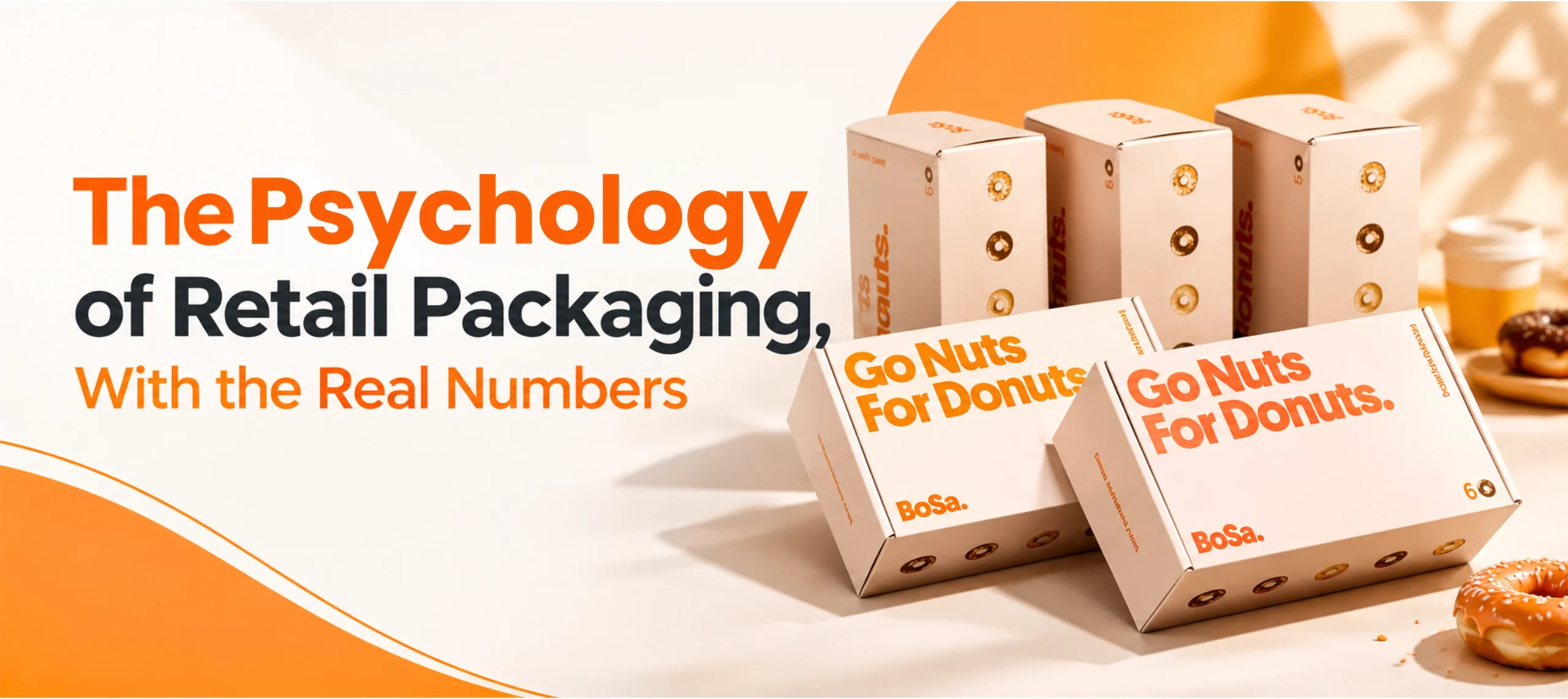
The Psychology of Retail Packaging, With the Real Numbers
 By
By The psychology of retail packaging really does shape buying decisions before a product is touched or read. Two specific numbers repeated to prove that point do not hold up once traced. Here is the real evidence, plus a more accurate picture of how color actually works across cultures.
The Real In Store Decision Number
A commonly repeated figure states that roughly 70 percent of purchasing decisions happen in store. That number is close, not exact. POPAI’s 2012 Shopper Engagement Study found 76 percent of grocery channel decisions were made in store. A separate, later 2014 study found 82 percent in the mass merchant channel. Neither figure is 70 percent. Both are real and dated. Both trace to a named source. That matters more than landing on a round number.
What Color Actually Does
A repeated claim states that packaging color determines 80 percent of a product’s appeal. That is not quite what the real research says. Satyendra Singh’s 2006 study, published in the journal Management Decision, is the actual source behind this area of marketing research. Color can account for up to roughly 90 percent of the snap judgment a person forms about a product. That judgment forms within about 90 seconds of first seeing it. Estimates in the wider literature range from about 62 to 90 percent. That is a claim about how fast a first impression forms. It is not a fixed 80 percent share of a product’s overall appeal.
Color Meaning Is Not Universal, and Not Random Either
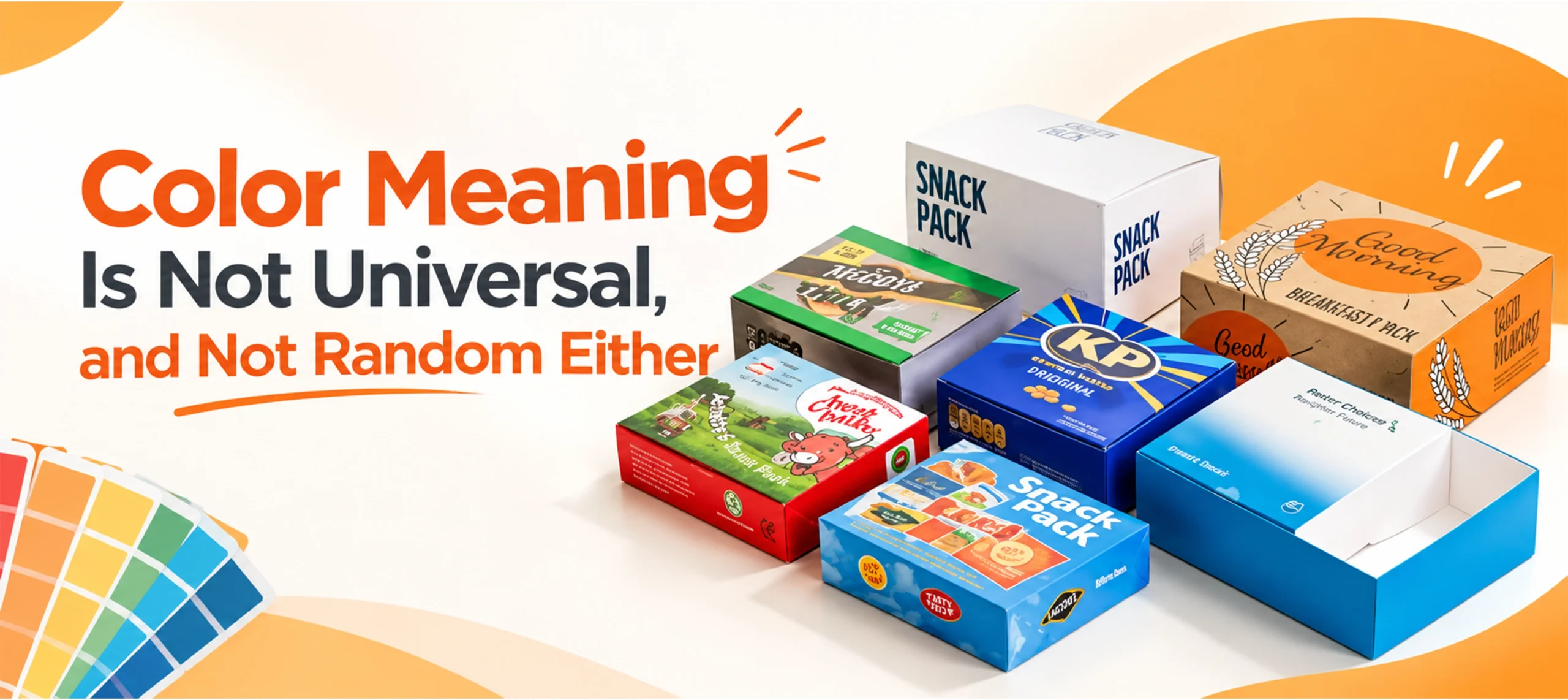
Red reads as exciting. Blue reads as trustworthy. Green reads as natural. These associations are real. Several pages researched here repeat them as if they hold everywhere. They do not, not exactly.
White means purity and weddings across much of the West. The same white means mourning and funerals across much of East Asia. Red means danger or urgency in Western warning contexts. The same red means luck and celebration across much of China. A peer reviewed cross cultural study found something more specific than a flat “colors mean the same everywhere” or “colors mean something different everywhere.” It compared Western and Chinese participants. It found a real cultural gap in how red and green are linked to good or bad, at a gut level. It found no real gap in how red and white are linked that way, even though people’s stated meaning for white differs sharply between the two cultures. Gut reaction and stated meaning are not always the same thing. That gap is the real, useful finding here.
Typography and Texture Still Matter
Bold fonts read as powerful. That is why energy drinks and sports gear lean on them. Serif fonts read as established. That is why wine and perfume lean the other way. None of that needs a specific statistic to be true. It is a design convention, tested constantly by brands. It is not a psychological law with a fixed percentage attached.
Texture works the same way. A soft touch coating changes how premium a product feels in hand before a single word is read. That effect is real and well documented in packaging design practice. No single number needs to be cited for it.
Packaging Psychology on Custom Boxes Deals Packaging
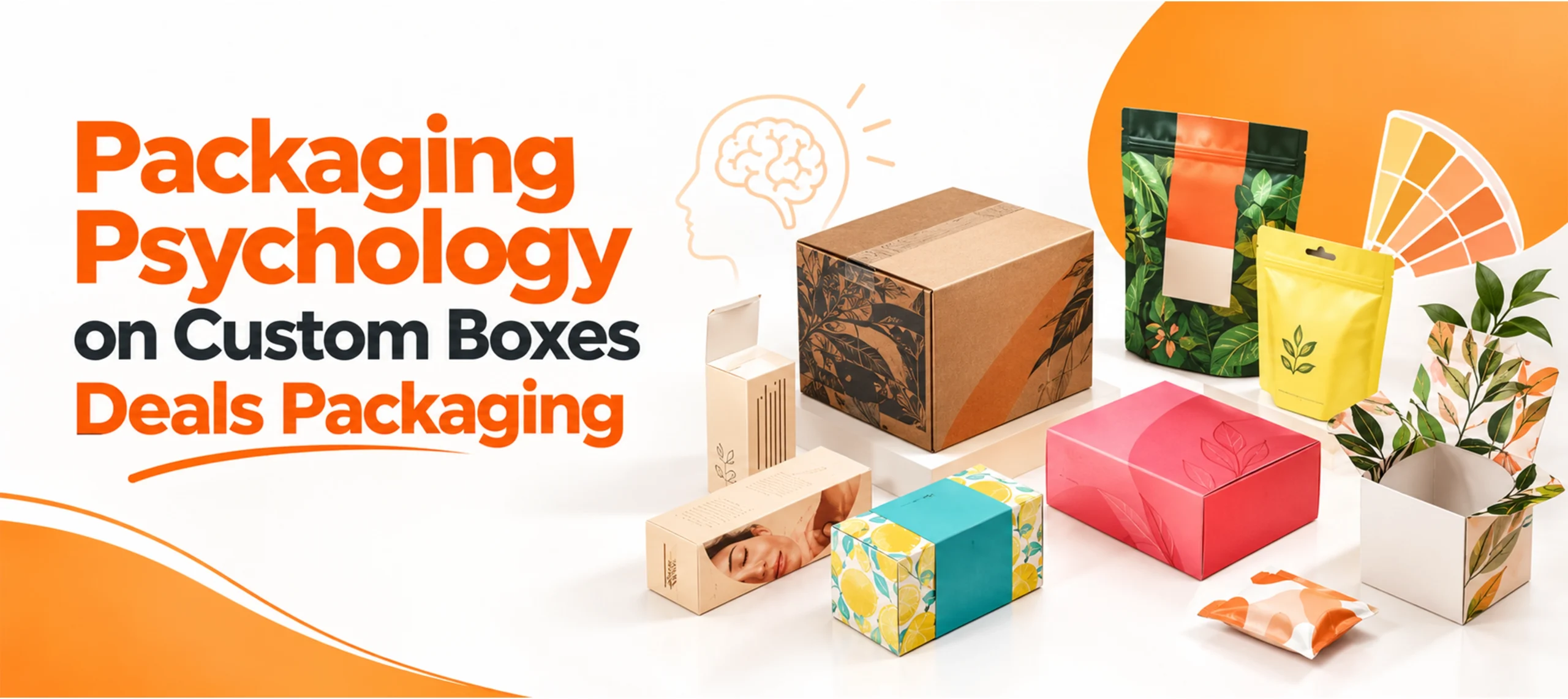
Finish and material choices are what actually turn this psychology into a real product on a shelf. Custom rigid boxes puts weight, texture and finish to work on the perceived value side of that equation. Custom cosmetic boxes sits in a category where color choice carries an outsized share of that fast, first glance judgment.
Frequently Asked Questions
Is it true that 70 percent of purchasing decisions happen in store?
Not exactly. Real POPAI research found 76 percent for the grocery channel in 2012 and 82 percent for the mass merchant channel in 2014. Both figures are real and dated, just not the rounded 70 percent often repeated.
Does packaging color really determine 80 percent of a product’s appeal?
Not as stated. The real academic source behind this claim, a 2006 study by Satyendra Singh, found color can account for up to about 90 percent of an initial snap judgment formed within roughly 90 seconds, not a fixed 80 percent of overall appeal.
Does a color like red or white mean the same thing in every culture?
Not always. White is tied to purity in the West and mourning in much of East Asia. Red is tied to danger in Western warning contexts and to luck in much of China. Research also shows the gut level reaction to a color and its consciously stated meaning are not always the same thing.
Do typography and texture affect buying decisions the same way color does?
They matter, but less has been measured with a specific statistic. Bold fonts read as powerful, serif fonts read as established, and texture like soft touch coating changes perceived quality, all well established in design practice rather than tied to one fixed number.
Should a brand selling internationally use one color strategy everywhere?
No. Given real, documented cultural differences in what a color consciously signals, a color strategy built for one market should be checked before it is assumed to work the same way elsewhere.
What packaging does Custom Boxes Deals offer for brands focused on perceived value?
Custom rigid boxes for premium presentation, and custom cosmetic boxes for a category where color and first impression carry particular weight.

Anthony Kim
Hello, I'm Anthony Kim, a seasoned packaging consultant and designer. With a professional journey spanning over four years, I've evolved from a budding designer to a recognized expert in the field. Currently holding the position of Packaging Consultant, I've honed my skills in creating not just visually stunning packaging but also solutions that align with strategic business goals.
View all articles →