Request Your Custom Quote
Tell us what you need. Our team normally replies within one business day.
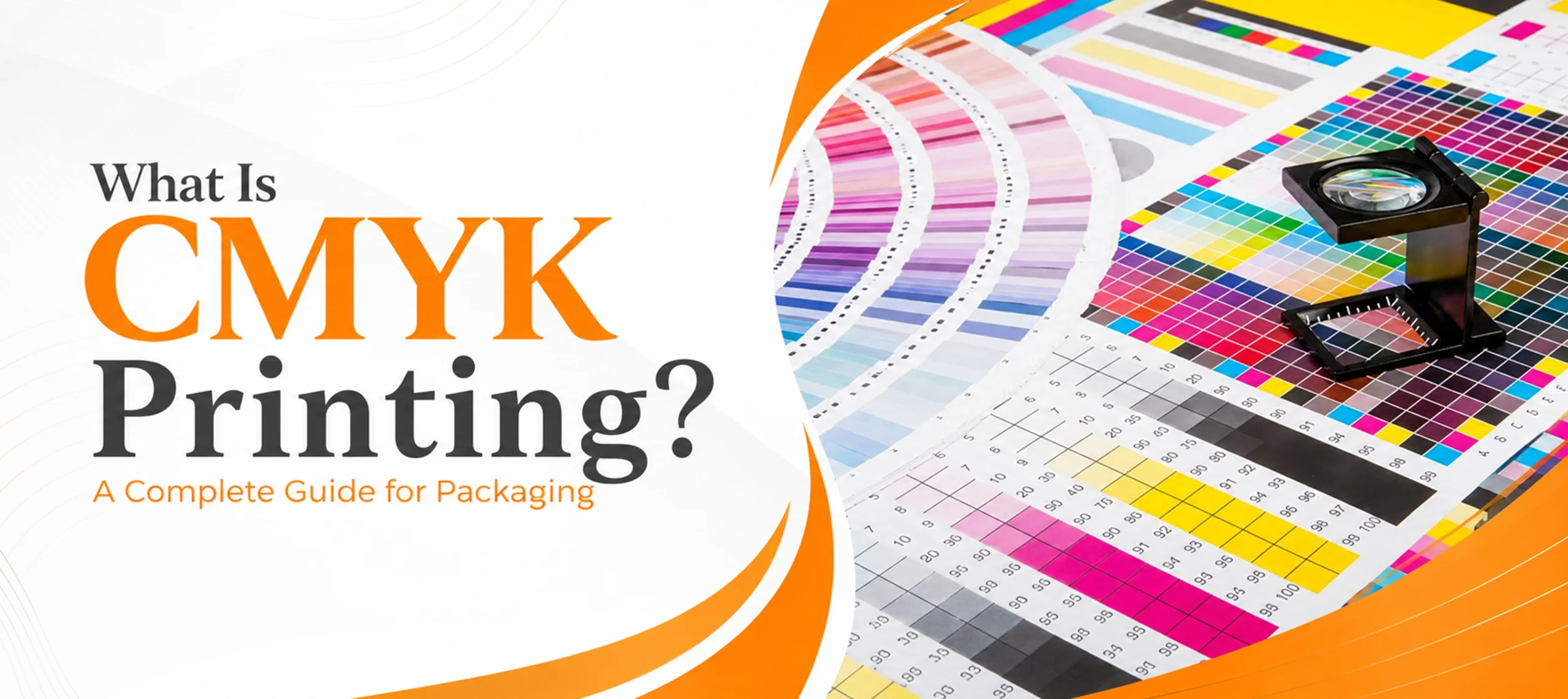
What Is CMYK Printing? A Complete Guide for Packaging
 By
By CMYK printing is a four ink process that builds full color images from cyan, magenta, yellow and black. Printers lay these four inks down as tiny dots. Your eye blends the dots together and sees one continuous color. Almost every printed box you have ever picked up was made this way, because four inks can reproduce thousands of colors at a fraction of the cost of mixing a separate ink for each one.
The part most guides skip is what happens next. The same CMYK file does not look the same on every box. Print it on white board and it looks bright. Print it on brown kraft and it looks like a different design. Since the material carries so much of the result, it pays to know how your chosen box style will print before you approve any artwork.
What Does CMYK Stand For?
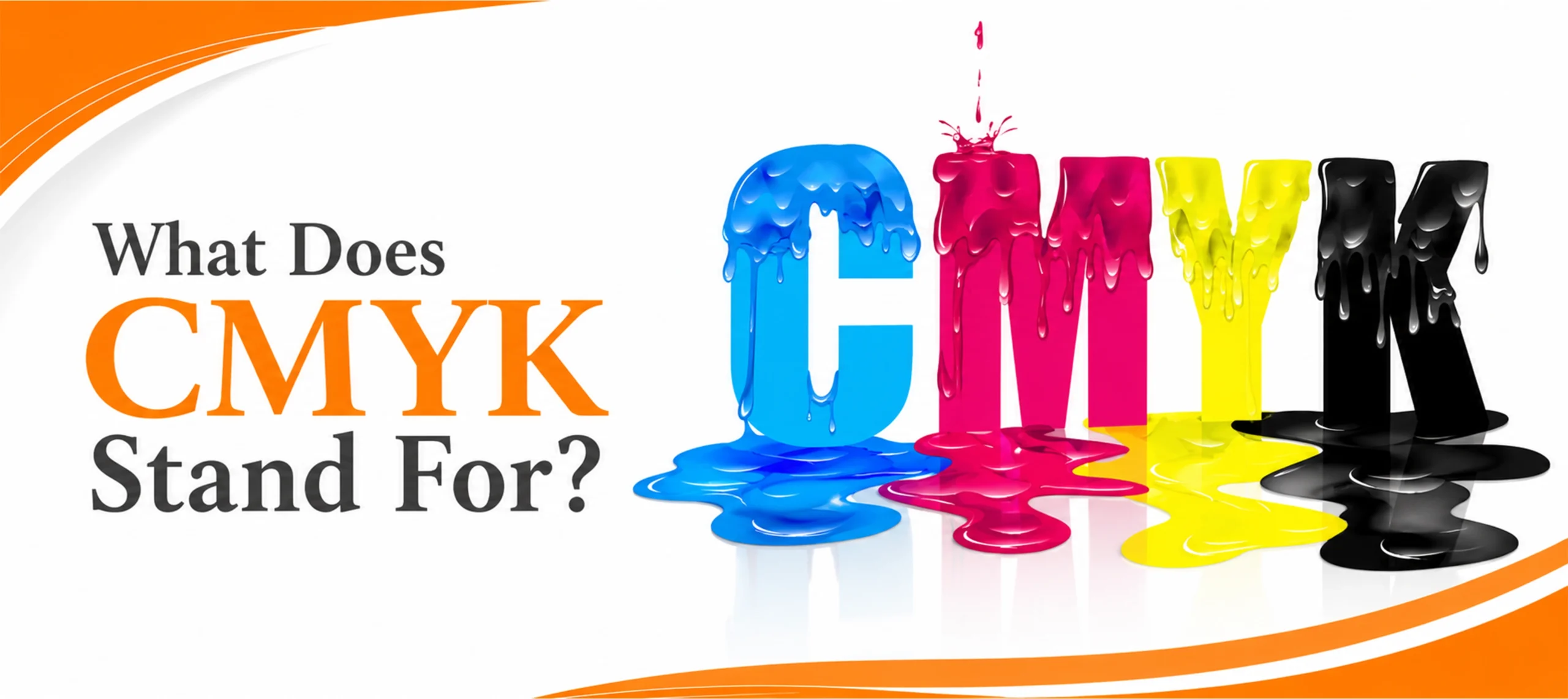
CMYK stands for cyan, magenta, yellow and key. Key means black.
Black gets its own letter because it does the heavy lifting. Cyan, magenta and yellow can be combined to make a muddy dark brown, but not a clean black. Adding a dedicated black ink gives you real depth in shadows, crisp text, and a much lighter load of ink on the sheet.
The four inks are printed as separate layers of dots. Where the dots overlap and where they sit side by side, your eye reads the mix as a single color. A rich red is not red ink. It is magenta and yellow dots sitting close enough together that you stop seeing them separately.
Why Printing Uses CMYK and Screens Use RGB
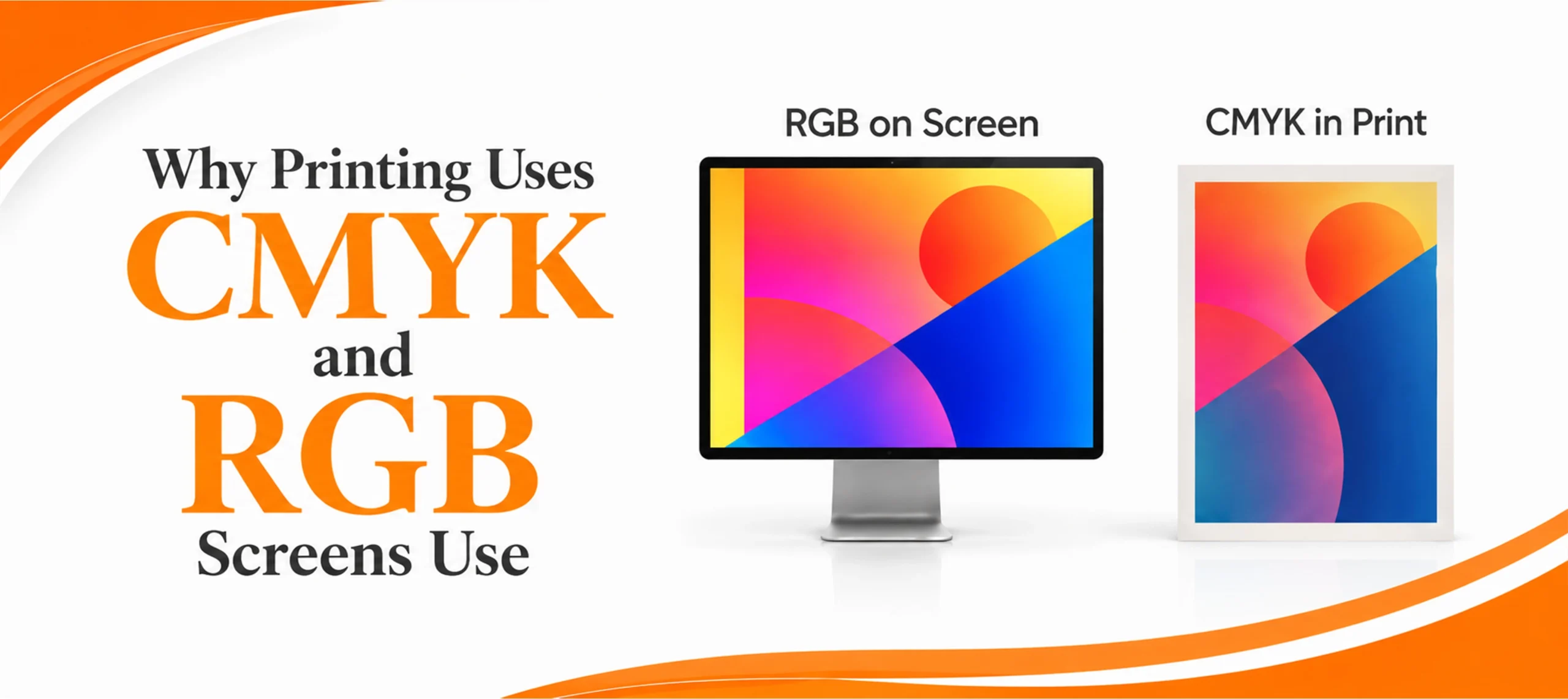
Your screen makes color by emitting light. Start with black and add red, green and blue light until you reach white. That is an additive system.
Print does the opposite. You start with a white sheet that reflects nearly all light, then lay ink on top to subtract wavelengths. Every ink you add removes more light and the sheet gets darker. That is a subtractive system, and it is why a box cannot glow the way a screen does.
This comparison should be set as a table on the page:
- RGB is used for screens. CMYK is used for print.
- RGB starts from black. CMYK starts from white paper.
- RGB works by adding light. CMYK works by subtracting light with ink.
- RGB can show bright neon colors. CMYK often cannot reach them.
- RGB is the design on your monitor. CMYK is the design on the shelf.
This is also why a color can look brilliant in your design file and flat on the finished box. Some screen colors, especially neon greens, hot oranges and electric blues, sit outside what four inks can physically mix. Nothing has gone wrong. The color simply does not exist in ink.
How CMYK Looks Different on Different Box Materials
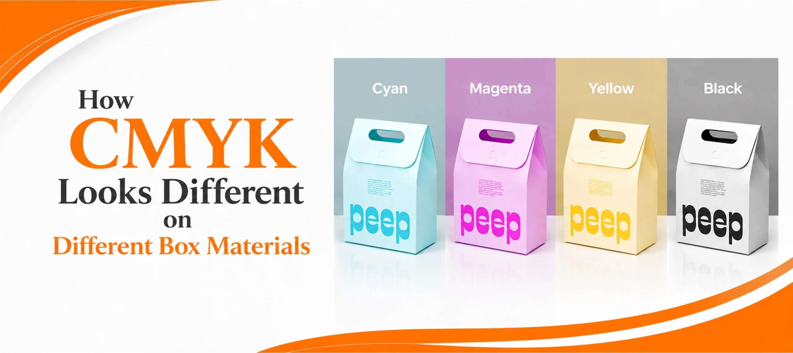
Ink does not sit on top of a box material. It soaks into it, and every material soaks differently.
A coated white surface holds ink on the surface, so dots stay sharp and colors stay bright. An uncoated or absorbent surface pulls ink in, dots spread slightly, and the same file prints softer and darker.
White coated board, such as SBS and cardstock. The most predictable surface there is. Colors land close to what you approved, fine detail holds, and photographic images reproduce well. If color accuracy matters most, this is the safe choice. It is the usual stock behind custom cosmetic boxes, where small type and skin tones both have to survive printing.
Brown kraft. Kraft is the one that surprises people. CMYK inks are translucent, so the brown underneath shows through everything you print. Pale colors go warm and muddy. Light blue drifts toward gray. And there is no white ink in CMYK at all, so anything meant to be white simply comes out kraft brown unless a white underbase is printed first. Kraft is a beautiful material, but design for it deliberately rather than reusing a file built for white board. Plenty of custom bakery boxes are printed on kraft for exactly this warm, natural look.
Corrugated. Corrugated has a fluted layer sandwiched inside it. Printing directly onto that structure can leave faint ridges across large flat areas of color, because the surface is not perfectly even underneath. Solid blocks of dark color show it most. Where print quality matters, the artwork is often printed on a flat sheet first and then mounted to the corrugated board, which keeps the image clean. This is worth knowing before you approve a design for custom pizza boxes or any shipping style box.
Rigid board. Rigid boxes are usually not printed directly. A separate sheet of paper is printed and then wrapped around the board. So the color you get is decided by that wrap stock, not by the gray chipboard underneath. That is good news: custom rigid boxes can carry excellent CMYK reproduction, because you are effectively printing on paper and then building the box around it.
Mylar and film. Film has no absorbency and no white base of its own. Color on custom mylar bags usually depends on a white ink layer printed underneath the CMYK, or on a metallic surface that changes the look entirely. Treat film as its own case rather than assuming board behavior carries over.
The practical rule is simple. Approve color on the material you are actually printing. A proof on white paper tells you very little about how the same file will look on kraft.
CMYK or Pantone: Which One Does Your Box Need?
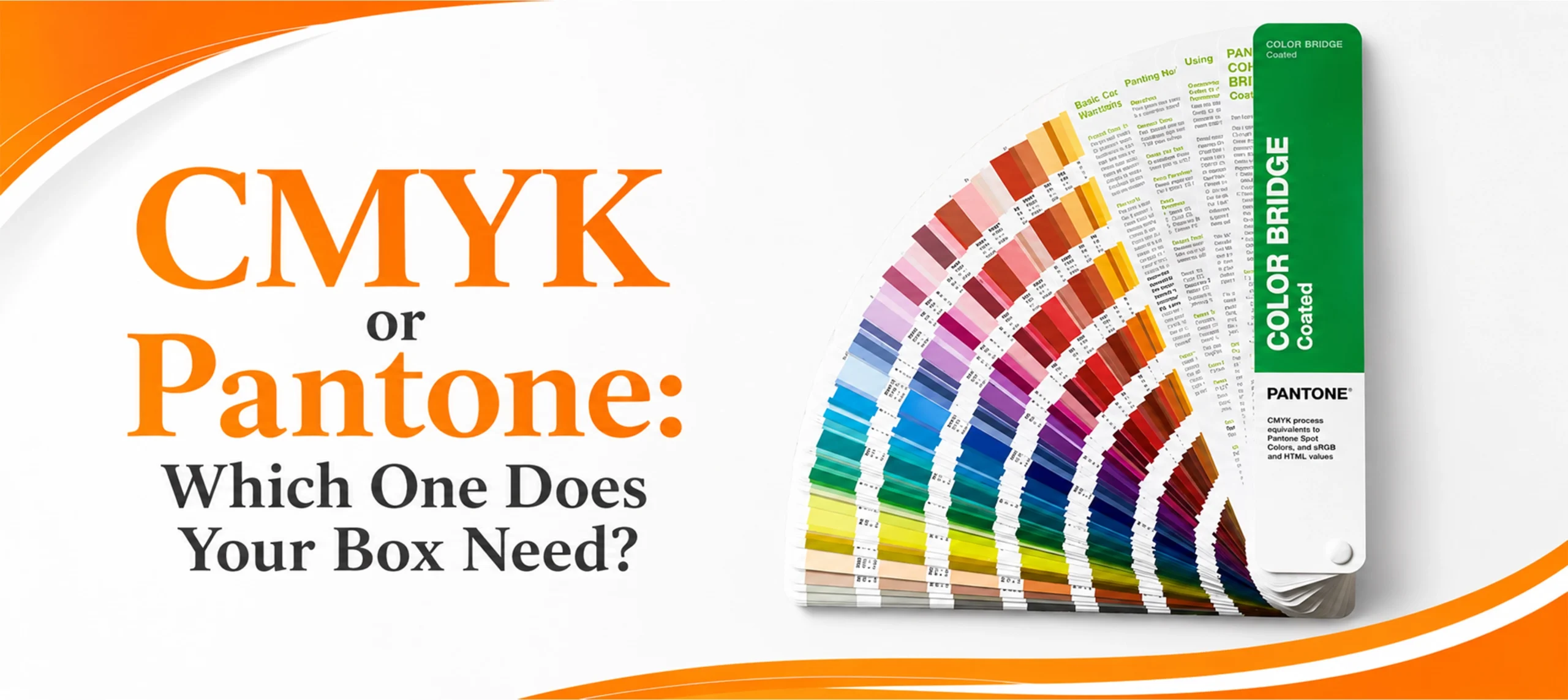
Pantone, often called PMS, works differently. Instead of building a color from four inks, the ink is pre mixed to an exact recipe before it ever reaches the press. It is the same color every run, on every machine.
Both are available. The right answer depends on the design, not on which one is better.
Choose CMYK when your design has photographs, gradients, shadows, or many different colors. Four inks can produce all of them. Mixing a separate ink for every shade would be slow and expensive, and would not look any better.
Choose Pantone when your brand lives or dies on one exact color. A logo in a single flat color, a large solid background, or a brand color that customers recognize instantly. CMYK can get close to most brand colors, but “close” varies slightly between runs. Pantone does not.
Choose both when you have a photographic design plus one brand color that has to be exact. Running CMYK for the imagery and adding a Pantone for the logo is common and works well.
A useful test: if you would notice the difference between two nearly identical versions of your brand color side by side, you want Pantone. If you would not, CMYK will serve you fine and cost less.
Total Ink Coverage: The Limit That Gets Artwork Rejected
This is the most common technical reason a print file causes trouble at the press, and most box buyers have never heard of it.
Each of the four inks can be laid down from 0 to 100 percent. Add all four together and you get total ink coverage, sometimes called total area coverage. A very deep black built from 100 percent of all four inks would be 400 percent coverage.
No press can handle that. Put too much wet ink on a sheet and, according to the prepress reference Prepressure’s guide to total ink coverage, the last ink down will not attach properly to the layers beneath it, neutral areas turn muddy brown, the sheet will not dry, and wet ink rubs off onto whatever is stacked on top of it.
The limits depend on the process and the stock. That same source gives these figures, which should be set as a table on the page:
- Sheetfed offset on coated paper: 320 to 340 percent.
- Heatset web offset, such as magazines: 300 to 320 percent.
- SWOP standard: 300 percent.
- Non heatset web offset on uncoated paper: 240 to 260 percent.
- Inkjet and copiers: 300 to 350 percent.
Notice the pattern. Absorbent uncoated stock takes far less ink than coated stock. This is the same reason kraft behaves differently from white board, viewed from the production side rather than the design side.
The practical takeaway for a box buyer: if your design has very dark, very saturated areas, mention it early. It is a five minute conversation before production and an expensive reprint afterwards.
Getting Your Print File Right
Most CMYK problems are set before anyone reaches a press.
Build the file in CMYK from the start rather than designing in RGB and converting at the end. A late conversion is where the sudden color shift happens, because colors that only existed on screen have to be forced into the nearest ink mix.
Label any Pantone colors clearly so they are not silently converted into a four ink approximation.
Supply vector artwork where you can, and send the file with the structural template so the printing and the cutting line up. The full detail on that side of file setup is covered in our guide to what a dieline is, which is worth reading alongside this one.
One more thing worth knowing: those small colored squares you sometimes see on the edge of packaging are print control patches, used to check that each ink is running at the right density. We explain them in what the colored dots on food packaging mean.
Finishes are applied after printing, and they change how the color reads. Matte lamination softens and slightly darkens color. Gloss deepens it. A spot UV finish adds shine to chosen areas only. Which finishes are available depends on the material and the box style, so they are worth confirming rather than assuming.
At Custom Boxes Deals we print CMYK, Pantone or PMS, or leave stock unprinted, and design support is free with no design fees. You get a free 3D mockup before production approval, and a real product video of the packaging before bulk production begins, so color and finish are confirmed on the actual job rather than guessed from a screen. Our minimum order is 100 units per design.
Frequently Asked Questions

What does CMYK stand for?
Cyan, magenta, yellow and key. Key means black. Black gets its own ink because the other three cannot mix a clean, deep black on their own.
Why do printers use CMYK instead of RGB?
RGB makes color by adding light and only works on a screen. Printing works by subtracting light with ink on a white sheet, which is a different physical process. CMYK is the four ink system built for it.
Will my box look exactly like my screen?
No, and no printing process can promise that. Screens emit light and boxes reflect it. Some bright screen colors cannot be mixed from ink at all. Approve a physical or digital proof rather than judging color from a monitor.
Is CMYK or Pantone better for packaging?
Neither is better. CMYK suits photographs, gradients and multicolor designs. Pantone suits an exact brand color that must match every run. Many boxes use both.
Can you print white in CMYK?
No. There is no white ink in the CMYK set. On white board, white areas are simply unprinted paper. On kraft, mylar or any colored stock, a separate white underbase has to be printed first.
Does CMYK print the same on kraft and white board?
No. Kraft is brown and absorbent, so inks look warmer, darker and softer, and light colors shift noticeably. White coated board keeps colors bright and detail sharp. Design for the material you are actually using.

Anthony Kim
Hello, I'm Anthony Kim, a seasoned packaging consultant and designer. With a professional journey spanning over four years, I've evolved from a budding designer to a recognized expert in the field. Currently holding the position of Packaging Consultant, I've honed my skills in creating not just visually stunning packaging but also solutions that align with strategic business goals.
View all articles →